Turning a new page[s]
2 min read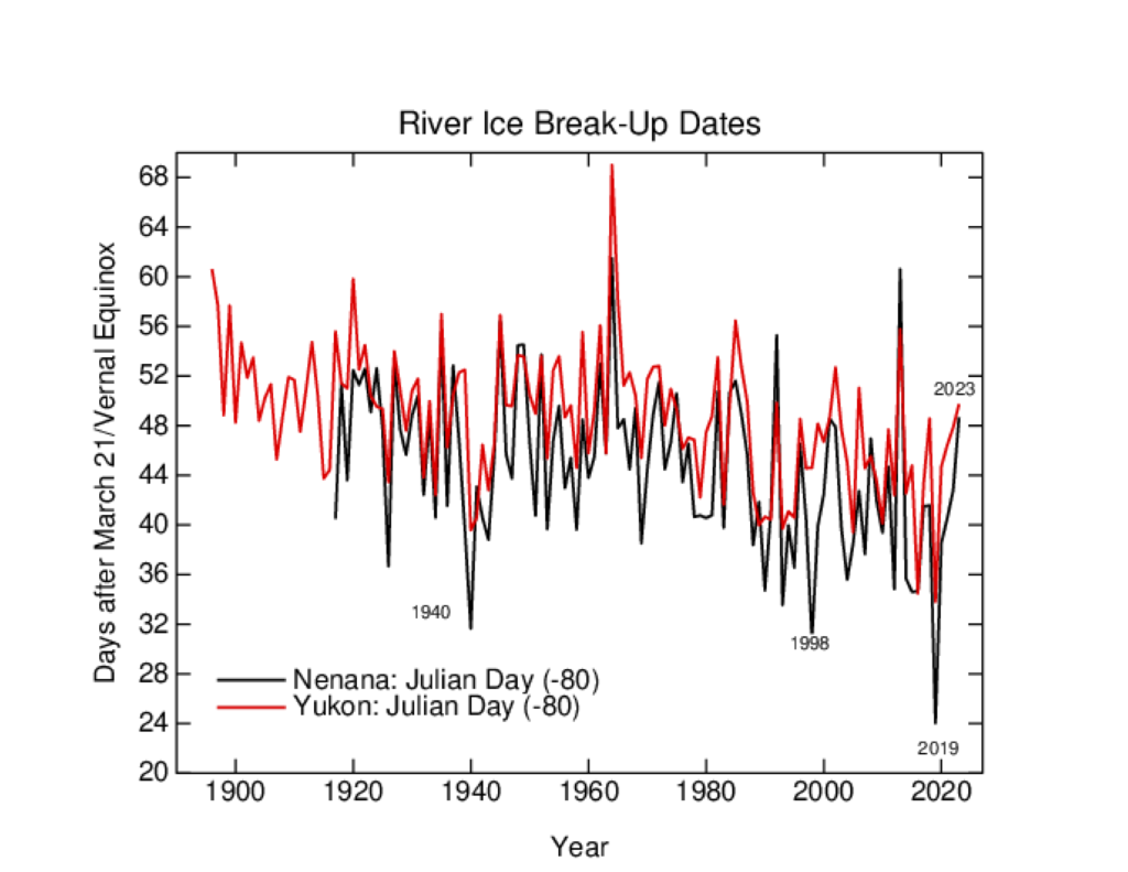
The world is full of climate dashboards (and dashboards of dashboards), and so you might imagine that all datasets and comparisons are instantly available in whatever graphical form you like. Unfortunately, we often want graphics to emphasize a particular point or comparison, and generic graphs from the producers of the data often don’t have the same goal in mind. Dashboards that allow for more flexibility (like WoodForTrees) are useful, but aren’t as visually appealing as they could be. Thus, I find myself creating bespoke graphics of climate and climate model data all the time.
Some of these are maintained on the Climate model-observations comparison page but many of the graphs that I make (often to make a point on twitter) aren’t saved there and often their provenance is a bit obscure. Given that twitter will not last forever (though it might be around for slightly longer than a head of lettuce), it’s probably useful to have a spot to upload these graphics to, along with some explanation, to serve as a reference.
I have therefore created a couple of ‘pages’ (in wordpress speak) with fixed URLs where I will be curating relevant graphics I make (and findable at the bottom of the page under “DATA AND GRAPHICS”). The first is focused on the surface temperature records. I often update relevant graphics associated with this in early January (when we get another dot on the graphs), but there are associated graphs that I’ve made that don’t make it into those updates, so this is a place for them too. This includes the impacts of ENSO, comparisons across different platforms, or the impact of homogenization.
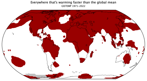
The second page is bit more eclectic. These are graphs that are relevant to some trope or talking point that often pops up, and my graphs are an attempt to provide context (usually), or to debunk it entirely. This is where you’ll find maps of where the climate is warming faster than the global average, time-series of river ice break-up dates, and an example of sensible scaling of CO2 changes and temperature.
To start with, I’m just going to upload some graphs I’ve made recently (with any updates that are needed), and I’ll add content as I make something new. If there are any other ideas (that aren’t too involved!), I’ll be happy to look at adding those too. Let me know if this is useful.
The post Turning a new page[s] first appeared on RealClimate.