Back to basics
4 min read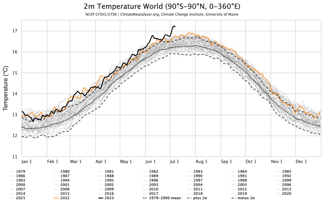
You can tell how worried the climate deniers are by how many fields of science they have to trash to try and have people not see what’s happening.
it will not have escaped most people’s notice that global temperatures are heading into uncharted territory. The proximate cause of this week’s headlines is the Climate Reanalyzer website at the U. Maine which provides a nice front end to the NOAA NCEP CFS forecast system and reanalysis and shows absolute daily temperatures in early July clearly exceeding the highest pre-existing temperatures from August 2016. It’s an arresting graphic, and follows in from the record high ocean surface temperatures that were being reported a month ago.
This is however a relatively new resource and was not online the last time that we set absolute temperature records (in summer 2016). So this has both salience and novelty – a potent combination!
The ultimate cause of these patterns is of course the ongoing global warming, driven almost entirely by human activities.
What are we looking at?
As we’ve explained before, all global temperature products are based on some kind of model – statistical, physical etc. There is no direct measurement of the global temperature – not from satellites, stations, or from the one random person who happens to be in most average place on Earth (where might that even be?). But that doesn’t mean the products aren’t useful!
In this particular instance we are looking at the output of a weather forecast model (NCEP CFS) that ingests multiple sources of in situ and satellite data every 3 hours which is then averaged over a day and over the surface of the planet. These calculations are precise reflections of what is in the model, but for multiple reasons this might not be a perfect reflection of what the real world is doing.
We looked at the coherence of different products, including the reanalyses, before and found that while they are highly correlated in terms of annual anomalies, they differ in their absolute magnitude (graphic from 2017).
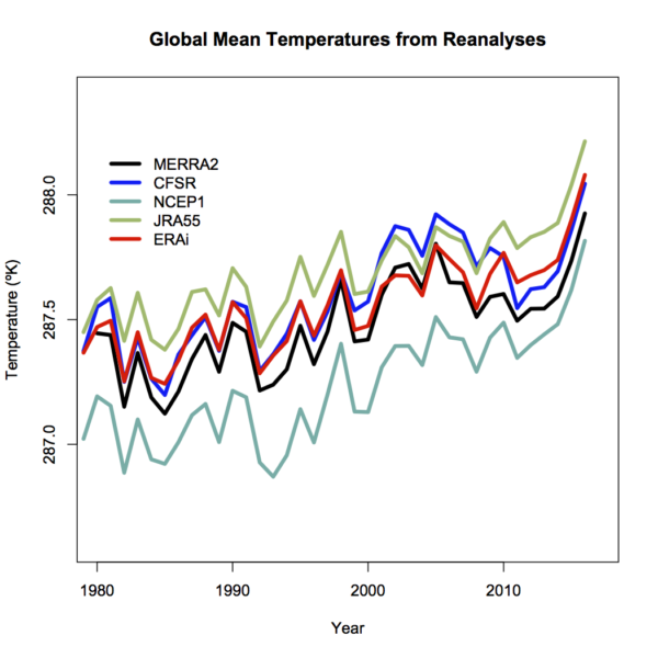
Differences will depend on resolution – higher resolution models have better (and higher topography) and then will have slightly cooler temperatures (all else being equal – which it isn’t!), tuning, model structure etc. and can’t really be discriminated using the pure (sparse) observations.
Coherence at the monthly scale is also quite good (though a little noisier), and I haven’t (yet) seen a good comparison of the coherence of the different products at the daily scale (note that the standard products (like GISTEMP, HadCRUT5 and NOAAv5) don’t produce a daily product). One might anticipate that there is a similarity, but perhaps not a one-to-one correspondence on exactly which days were the warmest.
What are we seeing?
For the global temperature, it’s well established that the maximum is during the Northern Hemisphere summer. This sometimes comes as a surprise to people (why doesn’t the opposing seasonality in the Southern Hemisphere cancel this out?), but it relates to the fact that there is a lot more land in the Northern Hemisphere. Since the seasonal cycle over land is much larger than over the ocean (smaller heat capacity, and less evaporation), that means that the seasonal variations in the north outweigh the variations in the south.
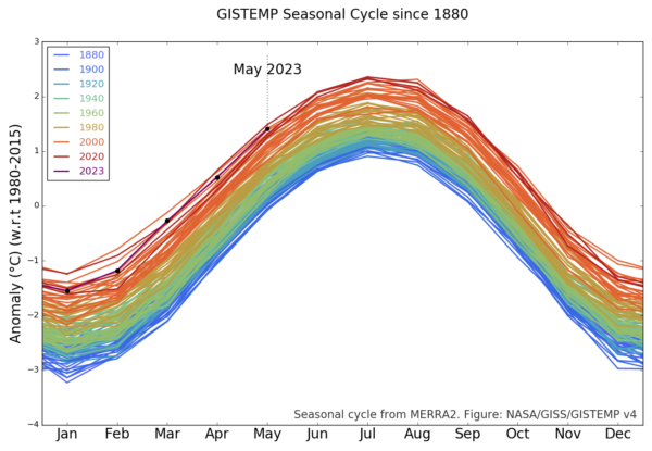
Thus the months of July and August are generally the warmest in the year, and consequently we expect the warmest days during those months – and this is reflected in the CFS output (and in the ERA5 output also). The monthly variations are also reflected in the GISTEMP product which allows you to see the shifts from 1880 onward (about a 1ºC warming in each month since the late 19th C):
The station-based products are a little delayed with respect to the reanalyses, but they generally reflect the same patterns – thus one should expect the June temperatures in NOAA, GISTEMP and HadCRUT5 to be the warmest June on record. Given too, that these temperatures are being driven by persistent warming in the oceans, increasingly juiced by the growing El Niño event in the tropical Pacific, records in July and August are also likely. This is of course increasing the odds for 2023 to be a record year (I would estimate about 50% at this point).
But the WSJ Opinion page says that there’s no such thing as the global temperature!
Well, they would say that wouldn’t they. [Narrator: there is, in fact, a perfectly well defined global mean of any two-dimensional field defined on the sphere, including temperature].
More generously, one might think that their argument (such as it is), is that the global mean isn’t directly relevant for anyone. That is, no-one lives in the global mean, all impacts are local and driven by weather variations. But we’ve known for decades that the global mean change is a really good predictor (not perfect, but pretty good) of local impacts on heat waves, intense rainfall, drought intensity etc.
But let’s be honest, it’s basically pure distraction and attempts to complicate something that is pretty basic:
The climate is warming, records are being broken, and we are increasingly seeing the impacts.
I know why the WSJ doesn’t want you to realise this, but it’s not hard to see past their obfuscation.
The post Back to basics first appeared on RealClimate.