Can we make better graphs of global temperature history?
6 min read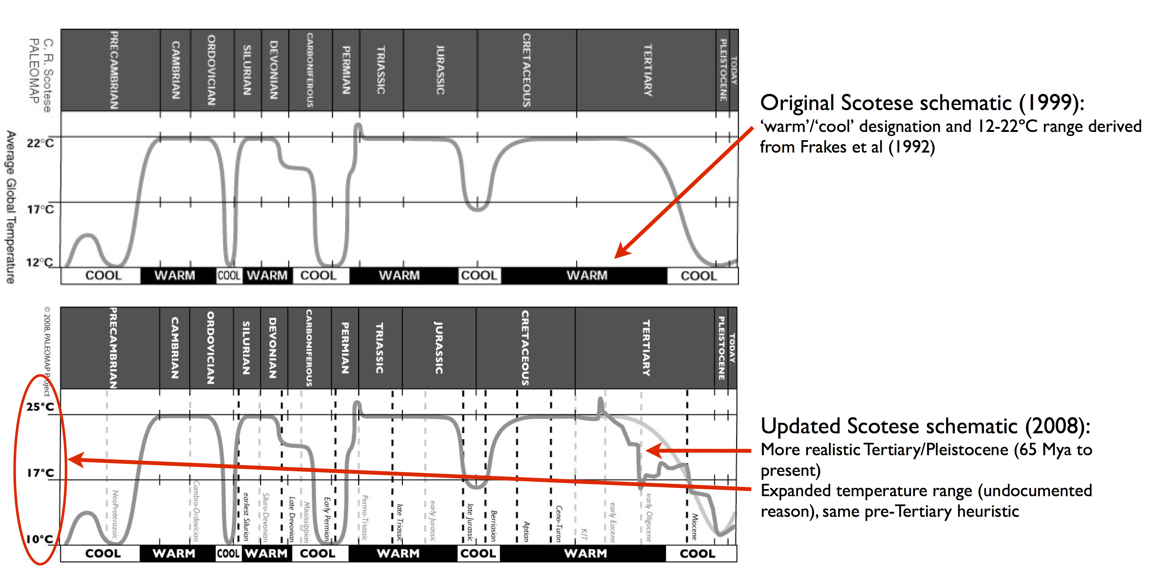
RealClimate –
I’m writing this post to see if our audience can help out with a challenge: Can we collectively produce some coherent, properly referenced, open-source, scalable graphics of global temperature history that will be accessible and clear enough that we can effectively out-compete the myriad inaccurate and misleading pictures that continually do the rounds on social media?
Bad graphs
One of the most common fallacies in climate is the notion that, because the climate was hotter than now in the Eocene or Cretaceous or Devonian periods, we should have no concern for current global warming. Often this is combined with an implication that mainstream scientists are somehow unaware of these warmer periods (despite many of us having written multiple papers on previous warm climates). This is fallacious on multiple grounds, not least because everyone (including IPCC) has been discussing these periods for ages. Additionally, we know that sea levels during those peak warm periods were some 80 meters higher than today, and that impacts of the current global warming are going to be felt by societies and existing ecosystems that are adapted for Holocene climates – not climates 100 million years ago.
In making this point the most common graph that gets used is one originally put online by “Monte Hieb” on this website. Over the years, the graphic has changed slightly
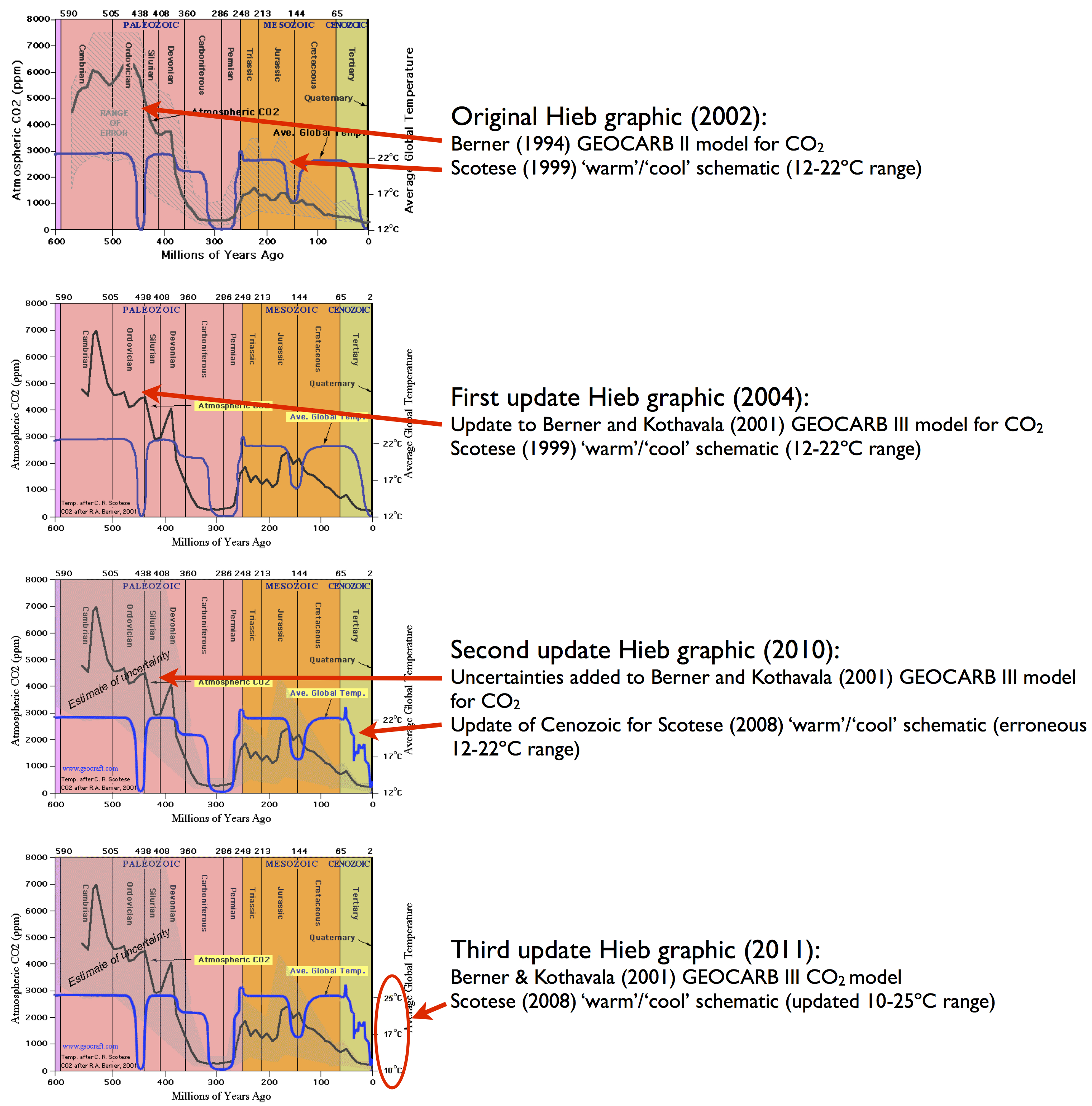
(versions courtesy of the wayback machine), but the essential points have remained the same. The ‘temperature’ record is a hand-drawn schematic derived from the work of Chris Scotese, and the CO2 graph is from a model that uses tectonic and chemical weathering histories to estimate CO2 levels (Berner 1994; Berner and Kothavala, 2001). In neither case is there an abundance of measured data.
The original Scotese renderings are also available (again, earlier versions via the wayback machine):
Scotese is an expert in reconstructions of continental positions through time and in creating his ‘temperature reconstruction’ he is basically following an old-fashioned idea (best exemplified by Frakes et al’s 1992 textbook) that the planet has two long-term stable equilibria (‘warm’ or ‘cool’) which it has oscillated between over geologic history. This kind of heuristic reconstruction comes from the qualitative geological record which gives indications of glaciations and hothouses, but is not really adequate for quantitative reconstructions of global mean temperatures. Over the last few decades, much better geochemical proxy compilations with better dating have appeared (for instance, Royer et al (2004)) and the idea that there are only two long-term climate states has long fallen by the wayside.
However, since this graphic has long been a favorite of the climate dismissives, many different versions do the rounds, mostly forwarded by people who have no idea of the provenance of the image or the lack of underlying data, or the updates that have occurred. Indeed, the 2004 version is the most common, having been given a boost by Monckton in 2008 and many others. Most recently, Patrick Moore declared that this was his favorite graph.
Better graphs
While more realistic graphs of temperature and CO2 histories will not prevent the basic fallacy we started discussing from being propagated, I think people should be encouraged to use actual data to make their points so that at least rebuttals of any logical fallacies wouldn’t have to waste time arguing about the underlying data. Plus it is so much better to have figures that don’t need a week to decipher (see some more principles at Betterfigures.org).
Some better examples of long term climate change graphics do exist. This one from Veizer et al (2000) for instance (as rendered by Robert Rohde):

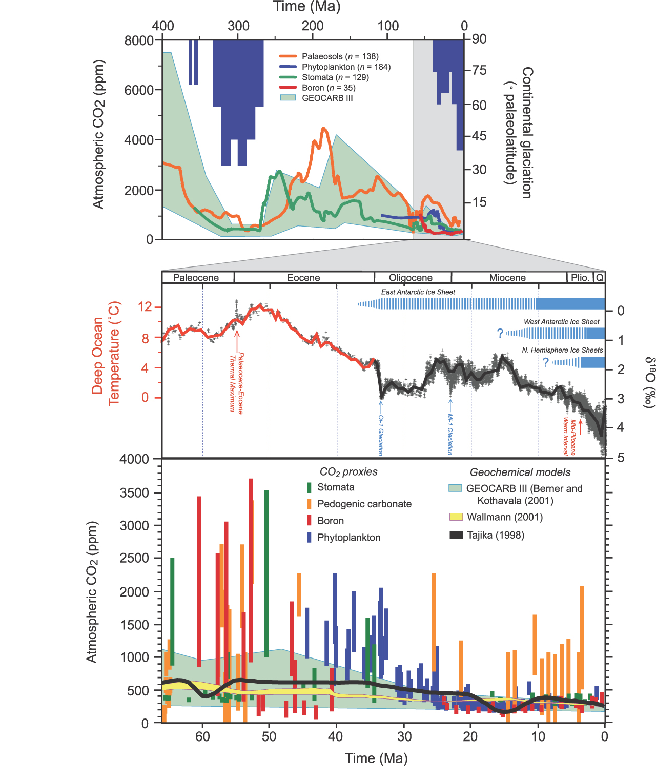
IPCC AR4 made a collation for the Cenozoic (65 Mya ago to present):
and some editors at Wikipedia have made an attempt to produce a complete record for the Phanerozoic:

But these collations are imperfect in many ways. On the last figure the time axis is a rather confusing mix of linear segments and logarithmic scaling, there is no calibration during overlap periods, and the scaling and baselining of the individual, differently sourced data is a little ad hoc. Wikipedia has figures for other time periods that have not been updated in years and treatment of uncertainties is haphazard (many originally from GlobalWarmingArt).
I think this could all be done better. However, creating good graphics takes time and some skill, especially when the sources of data are so disparate. So this might be usefully done using some crowd-sourcing – where we collectively gather the data that we can find, process it so that we have clean data, discuss ways to fit it together, and try out different plotting styles. The goal would be to come up with a set of coherent up-to-date (and updatable) figures that could become a new standard for representing the temperature history of the planet. Thus…
The world temperature history challenge
The challenge comes in three parts:
- Finding suitable data
- Combining different data sets appropriately
- Graphically rendering the data
Each part requires work which could be spread widely across the participants. I have made a start on collating links to suitable data sets, and this can both be expanded upon and consolidated.
| Period | Reference | Data download |
| 0-600 Mya | Veizer et al (2000), Royer et al (2004) (updated Royer (2014)) | Veizer d180, Royer04 Temp, Royer14 CO2 |
| 0-65 Mya | Zachos et al (2008), Hansen et al (2010) | Zachos/Hansen |
| 0-5.3 Mya | Lisiecki and Raymo (2005) | LR04 Stack |
| 0-800 kya | EPICA Dome C | Temperature Reconstruction |
| 0-125 kya | NGRIP/Antarctic analog? | NGRIP 50yr |
| 0-12 kya | Marcott et al (2013) | MEA12 stack (xls) |
| 0-2 kya | Mann et al (2008), Ljungqvist (2010) | MEA08 EIV, Ljungqvist10 |
| 1880-2013 CE | GISTEMP | GISTEMP LOTI |
| 1850-2013 CE | HadCRUT4 | HadCRUT4 Global annual average, Cowtan&Way (infilled) |
| 1850-2013 CE | Berkeley Earth | Land+Ocean annual mean |
Combining this data is certainly a challenge, and there are multiple approaches that could be used that range from the very simple to the very complex. More subtly the uncertainties need to be properly combined also. Issues range from temporal and spatial coverage, time-dependent corrections in d18O for long term geologic processes or ice volume corrections, dating uncertainty etc.
Finally, rendering the graphics calls for additional skills – not least so that the different sources of data are clear, that the views over different timescales are coherent, and that the graphics are in the Wiki-standard SVG format (this site can be used for conversion from pdf or postscript).
Suggestions for other data sets to consider, issues of calibration and uncertainty and trial efforts are all welcome in the comments. If we make some collective progress, I’ll put up a new post describing the finished product(s). Who knows, you folks might even write a paper…
This post was inspired by a twitter conversation for Sou from Bundunga and some of the initial data links came via Robert Rohde (of Global Warming Art and now Berkeley Earth) and Dana Royer.
References
R.A. Berner, “GEOCARB II; a revised model of atmospheric CO 2 over Phanerozoic time”, American Journal of Science, vol. 294, pp. 56-91, 1994. https://dx.doi.org/10.2475/ajs.294.1.56
R.A. Berner, “GEOCARB III: A revised model of atmospheric CO2 over Phanerozoic time”, American Journal of Science, vol. 301, pp. 182-204, 2001. https://dx.doi.org/10.2475/ajs.301.2.182
J. Veizer, Y. Godderis, and L.M. François, “”, Nature, vol. 408, pp. 698-701, 2000. https://dx.doi.org/10.1038/35047044
D. Royer, “Atmospheric CO2 and O2 During the Phanerozoic: Tools, Patterns, and Impacts”, Treatise on Geochemistry, pp. 251-267, 2014. https://dx.doi.org/10.1016/B978-0-08-095975-7.01311-5
L.E. Lisiecki, and M.E. Raymo, ” A Pliocene-Pleistocene stack of 57 globally distributed benthic δ 18 O records “, Paleoceanography, vol. 20, pp. n/a-n/a, 2005. https://dx.doi.org/10.1029/2004PA001071
S.A. Marcott, J.D. Shakun, P.U. Clark, and A.C. Mix, “A Reconstruction of Regional and Global Temperature for the Past 11,300 Years”, Science, vol. 339, pp. 1198-1201, 2013. https://dx.doi.org/10.1126/science.1228026
M.E. Mann, Z. Zhang, M.K. Hughes, R.S. Bradley, S.K. Miller, S. Rutherford, and F. Ni, “Proxy-based reconstructions of hemispheric and global surface temperature variations over the past two millennia”, Proceedings of the National Academy of Sciences, vol. 105, pp. 13252-13257, 2008. https://dx.doi.org/10.1073/pnas.0805721105
F.C. LJUNGQVIST, “A NEW RECONSTRUCTION OF TEMPERATURE VARIABILITY IN THE EXTRA-TROPICAL NORTHERN HEMISPHERE DURING THE LAST TWO MILLENNIA”, Geografiska Annaler: Series A, Physical Geography, vol. 92, pp. 339-351, 2010. https://dx.doi.org/10.1111/j.1468-0459.2010.00399.x
(c) RealClimate – Read entire story here.


