New daily temperature dataset from Berkeley
4 min read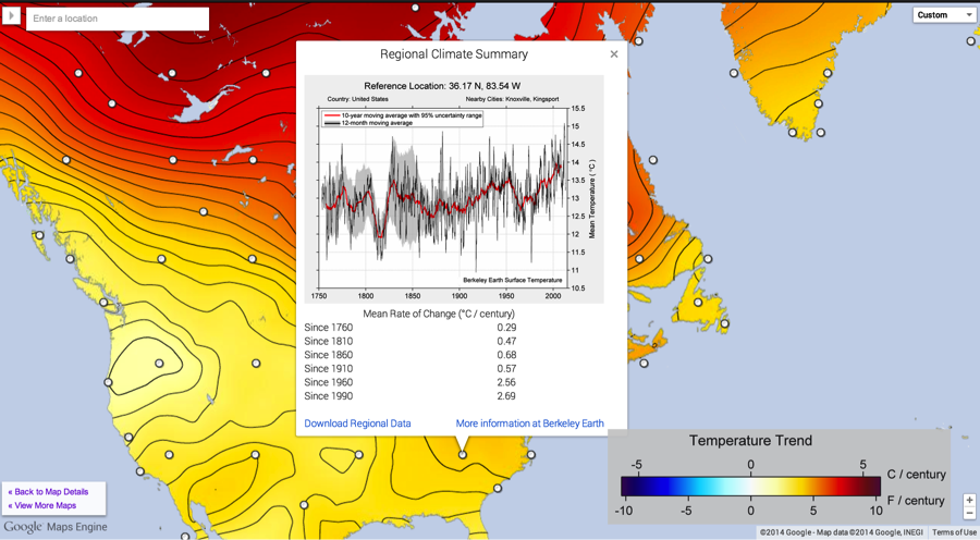
RealClimate –
Guest commentary from Zeke Hausfather and Robert Rohde
Daily temperature data is an important tool to help measure changes in extremes like heat waves and cold spells. To date, only raw quality controlled (but not homogenized) daily temperature data has been available through GHCN-Daily and similar sources. Using this data is problematic when looking at long-term trends, as localized biases like station moves, time of observation changes, and instrument changes can introduce significant biases.
For example, if you were studying the history of extreme heat in Chicago, you would find a slew of days in the late 1930s and early 1940s where the station currently at the Chicago O’Hare airport reported daily max temperatures above 45 degrees C (113 F). It turns out that, prior to the airport’s construction, the station now associated with the airport was on the top of a black roofed building closer to the city. This is a common occurrence for stations in the U.S., where many stations were moved from city cores to newly constructed airports or wastewater treatment plants in the 1940s. Using the raw data without correcting for these sorts of bias would not be particularly helpful in understanding changes in extremes.
Berkeley Earth has a newly released homogenized daily temperature field is built as a refinement upon our monthly temperature field using similar techniques. In constructing the monthly temperature field, we identified inhomogeneities in station time series caused by biasing events such as station moves and instrument changes, and measured their impact. The daily analysis begins by applying the same set of inhomogeneity breakpoints to the corresponding daily station time series.
Each daily time series is transformed into a series of temperature anomalies by subtracting from each daily observation the corresponding monthly average at the same station. These daily anomaly series are then combined using similar mathematics to our monthly process (e.g. Kriging), but with an empirically determined correlation vs. distance function that falls off more rapidly and accounts for the more localized nature of daily weather fluctuations. For each day, resulting daily temperature anomaly field is then added to the corresponding monthly temperature field to create an overall daily temperature field. The resulting daily temperature field captures the large day-to-day fluctuations in weather but also preserves the long-term characteristics already present in the monthly field.
As there are substantially more monthly records than daily records in the early periods (e.g. 1880-1950), treating the daily data as a refinement to the monthly data allows us to get maximum utility from the monthly data when determining long-term trends. Additionally, performing the Kriging step on daily anomaly fields simplifies the computation in a way that makes it much more computationally tractable.
You can find the homogenized gridded 1-degree latitude by 1-degree longitude daily temperature data here in NetCDF format (though note that a single daily series like TMin is ~4.2 GB). We will be releasing an individual homogenized station series in the near future. Additional videos of daily absolute temperatures are also available.
Climate Data Visualization with Google Maps Engine
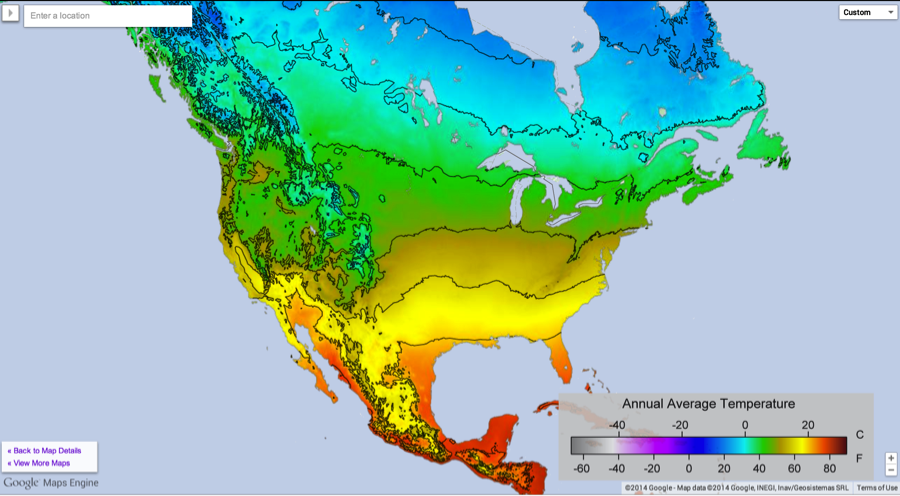
Through a partnership with Google we’ve created a number of different interactive climate maps using their new Maps Engine. These include maps of temperature trends from different periods to present (1810, 1860, 1910, 1960, 1990), maps of record high and low temperatures, and other interesting climate aspects like average temperature, daily temperature range, seasonal temperature range, and temperature variability.

These maps utilize a number of neat features of Google’s Maps Engine. They dynamically update as you zoom in, changing both the contour lines shown and the points of interest. For example, in the 1960-present trend map shown above, you can click on a point to show the regional climate summary for each location. As you zoom in, you can get see more clickable points appear. You can also enter a specific address in the search bar and see aspects of the climate at that location.
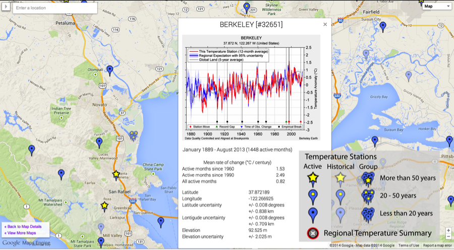
We also have a map of all ~40,000 stations in our database, markers for each that show the homogenized record for that station when clicked. These highlight all the detected breakpoints, and show how the station record compares to the regional expectation once breakpoints have been corrected. You can also click on the image to get to a web page for each station that shows the raw data as well as various statistics about the station.
New Global Temperature Series
Berkeley Earth has a new global temperature series available. This was created by combining our land record with a Kriged ocean time series using data from HadSST3. The results fit quite well with other published series, and are closest to the new estimates by Cowtan and Way. This is somewhat unsurprising, as both of us use HadSST3 as our ocean series and use Kriging for spatial interpolation.
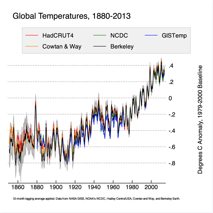
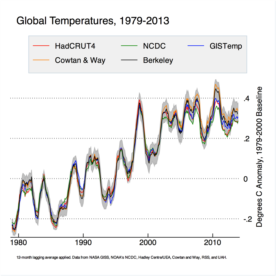
If we zoom into the period since 1979, both Berkeley and Cowtan and Way have somewhat higher trends than other series over the last decade. This is due mainly to the coverage over the arctic (note that we use air temperature over ice instead of sea temperature under ice for areas of the world with seasonal sea ice coverage).
(c) RealClimate – Read entire story here.


